Have you noticed anything different about our logo recently?
Every so often, we on the EverCheck Brand team take a step back and challenge everything we know to be true about our company. Is our mission statement still a reflection of why we get up and go to work every day? Do our brand attributes reflect the way we conduct ourselves?
These exercises help keep us in check. Our goal is to remain true to our core values while adapting to the ever-changing landscape of the industry we serve.
Recently, we took a hard look at our logo. It hadn’t changed much since 2012- when CE Broker for Business became EverCheck, officially. Funny enough, almost everything else had- the look and feel of our software, transitioning from software-as-a-service to platform-as-a-service, and so much more.
|
"As a company grows, it's important to continue to evolve the brand to be in line with the type of feeling that we want to create." - EverCheck’s Chief Design Officer, Alex Lauderdale |
We had two options - total rebranding or refinement. The total rebrand route would mean that our company “personality” had shifted entirely. That wasn’t really true, so we opted for the second option, refinement. With refinements, the foundation is solid, but you need just a bit more attention to detail. Often, it’s the combination of little adjustments that all add up to a more on-brand feeling and really set the company up for the future.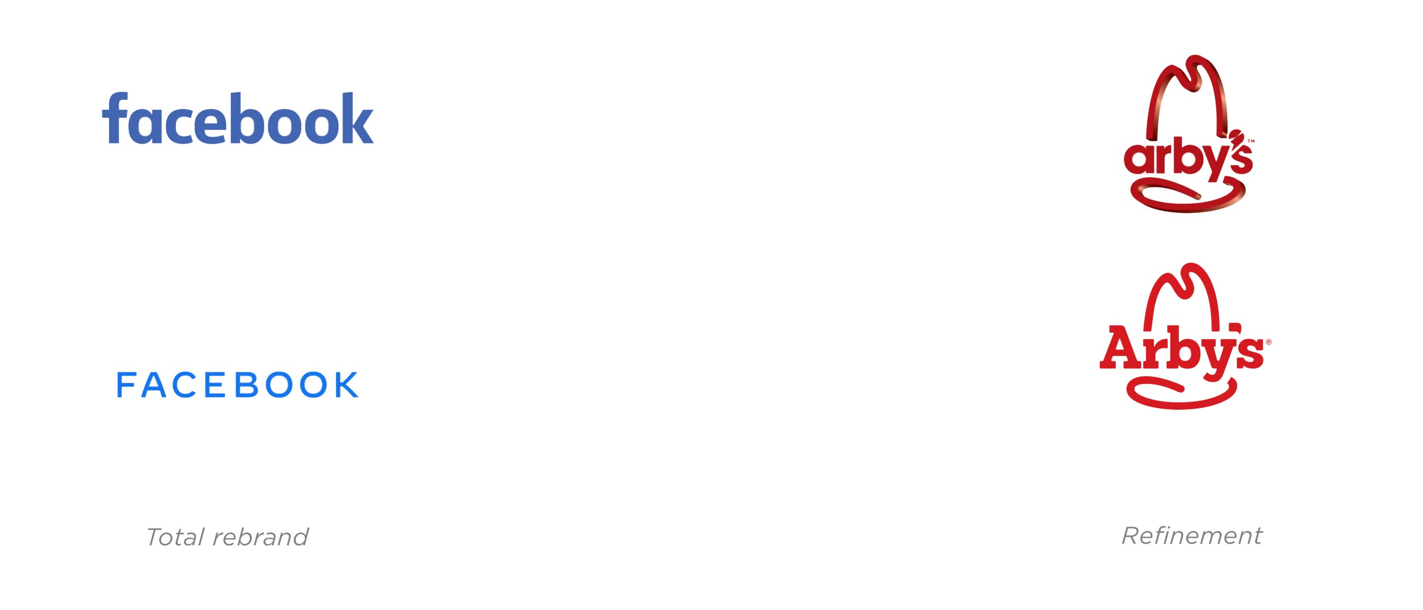
But what is a “brand” really anyway? If you distill it down to its simplest form, what people mean when they say “brand” is really how you make people feel when they think about or interact with your company. It’s that feeling you get when you log into the system, chat with your Client Success Manager, or hear from our COO. It’s the sum of those feelings, and what we want people to walk away with are feelings of trustworthiness, security, approachability, and ultra-modern technology.
Now that you have the background for our thinking, here’s how we landed on our subtle but expertly-refined logo for 2021 and beyond.
This was our logo. Familiar, comfortable, and nostalgic. It served us well from 2012-2020.


We identified areas of improvement - little adjustments like hard angles, spacing, and how the letters “lock up” with one another.

We arrived with refined spacing that’s easier on the eye. We rounded letter forms to soften the feel and made adjustments to the “r” so it “flows” with the “c.”

We looked at the arrow and identified areas where the geometry could be improved.

We arrived with a mark that snapped perfectly to a central grid.

We brightened up our color palette to make it more modern and vibrant.
And with the full picture in view, you can see how our brand attributes are reflected in these changes.
![]()
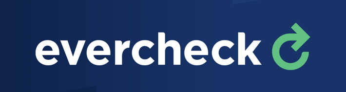
We’ve effectively evolved the feeling of our brand without losing the core of who we are.
See where you notice our fresh look popping up. Our website, which also received a makeover for the new year, has plenty of new-logo Easter eggs to discover. There, you can also get a sneak preview of our new sustainability initiatives for 2021 and beyond (hint: scroll to the bottom of the homepage).
Thanks for reading, and if you have any thoughts or feedback on the new look, drop us a line at feedback@evercheck.com.
- The EverCheck Brand Team